Brand Identity & Style Guide
Java Sutra Coffee Shop
Color Scheme, Typography, Logo, Icons, Social Media Header, and Brand Style Guide
Project & Company Details
Our mission was to create the branding for Java Sutra Coffee Shop, crafting a visual identity that accurately grasped a creative, community vibe. This comprehensive project included the creation of a new logo, packaging, and marketing materials to enhance brand recognition and appeal.
The Ask
The owner of Java Sutra wanted to ensure their business would make a good first impression on the neighborhood. They were aware that the look and feel of the brand would set the tone before any customers set foot in the shop, so they wanted to make sure that the identity of Java Sutra was consistent and created the proper mood.
I worked with the owner to determine the company’s personality, audience profile, and mission. I used the information to guide my design decisions when creating the brand identity for Karla’s Coffee. There was a three-month timeline to ensure that the owner would have enough time to implement the designs into the store signage, printed materials, and online presence before the grand opening.
The Approach
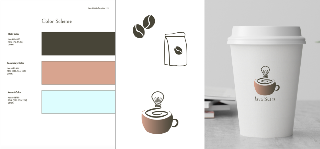
We created a color scheme of warm brown tones to invoke a feeling of belonging. We also included a light blue for that feeling of social cohesion we want to foster as a community.
I sought typefaces that would express an innovative, friendly, and trustworthy tone to support the personality of Java Sutra. For the main brand font, I selected Bellefair. The elegant serif style of Bellefair looks modern and reliable. Bellefair can also be used for large headings and navigation links.
I selected the sans-serif font Afacad Flux Light for large sections of smaller-sized text such as menu descriptions or body text on the website. This sans-serif font will be easy to read while conveying a reliable and relatable tone.
Perhaps the most identifiable part of a brand is its logo. With the colors and typefaces chosen, I drew a few sketches of logo ideas. I settled on a design with a coffee mug and a light bulb to show that Java Sutra is not only a coffee shop but a place for the creative community to come together and come up with big ideas.
I used Adobe Illustrator to create a vector version of the logo that scales to any size without losing quality. I also created a few logo variations for different use cases, such as a single-color logo or a black and white version.
I created a pair of icons in Adobe Illustrator for the menu or website. I chose coffee beans to represent the selection of different roasts and beans to be ordered as drinks within the shop. The menu icon is a bag of coffee beans to show that Java Sutra offers various coffee roasts and blends to bring home as well. Both icons use a consistent line style and color palette to coordinate with the overall brand style.
The owner also needed a social media header to promote the business as they prepared for their upcoming grand opening. I gathered various images that displayed the personality and colors for Java Sutra and created a Facebook banner.
I used Adobe Photoshop to create the social media header and mockups like Facebook cover photos.

Brand Style Guide
The final element of the branding package for Java Sutra was a full brand style guide that would bring all elements of their branding together in one place with clear guidelines for using each element.
I created the style guide in Adobe InDesign to customize the look and feel to match the colors and typography of the brand. Within the style guide, I included the company’s mission, personality, color palette (in Hex, RGB, and CMYK formats), font names and sample sizes, logos with guidelines for proper usage, icons, social media header guidelines, and imagery.
The full package will allow Java Sutra to maintain a consistent brand identity across all formats, whether physical or digital.

